
Welcome to SheetPlanner
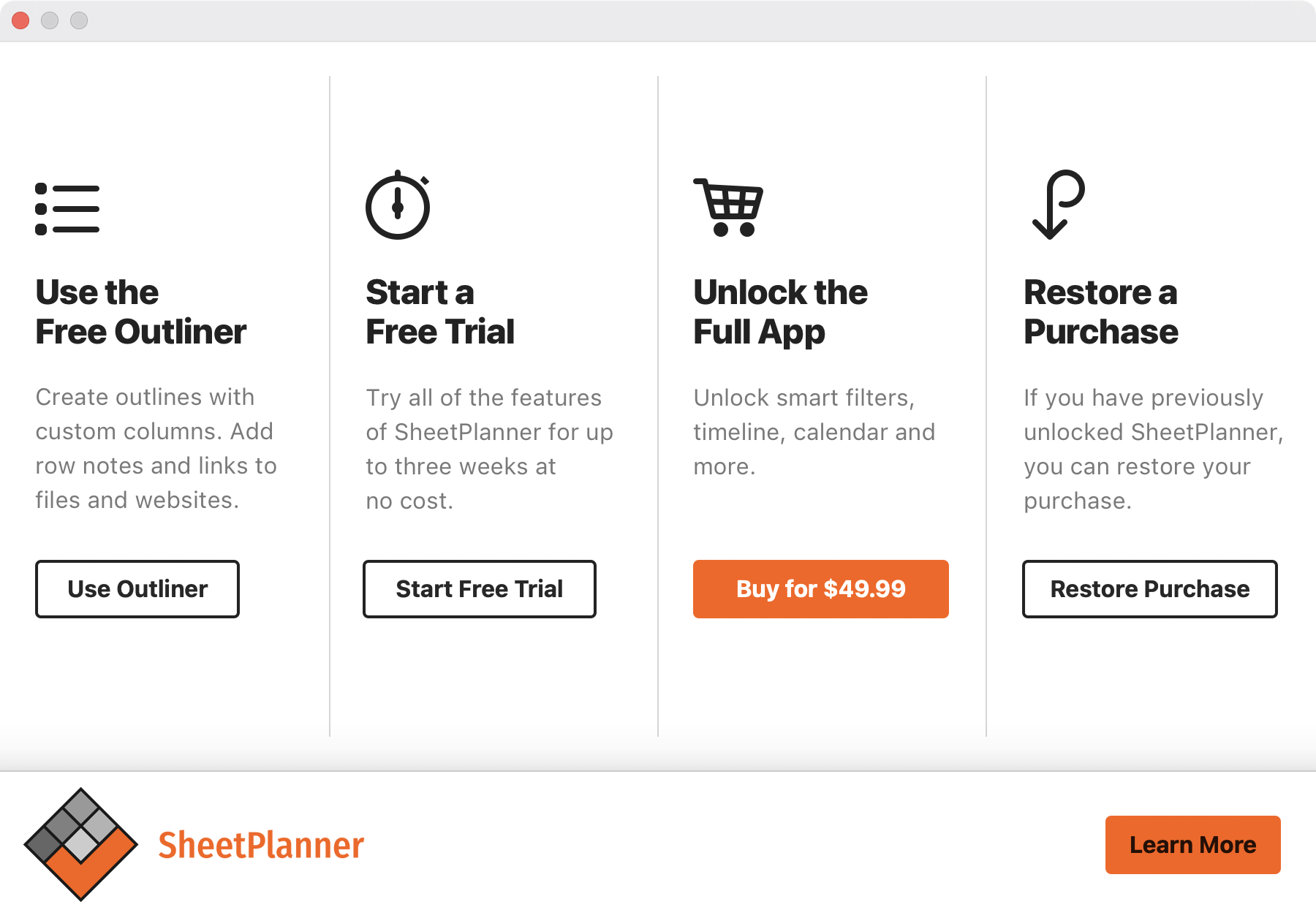
The first time you open SheetPlanner, there is an introductory slideshow that gives an overview of the application. At the end of this overview you can select to:
- Use the Free Outliner
- Start a Free Trial
- Unlock the Full App
- Restore a Purchase
Click Learn More to go to the SheetPlanner website.
Topics marked with * in the help are only available in the Full App.
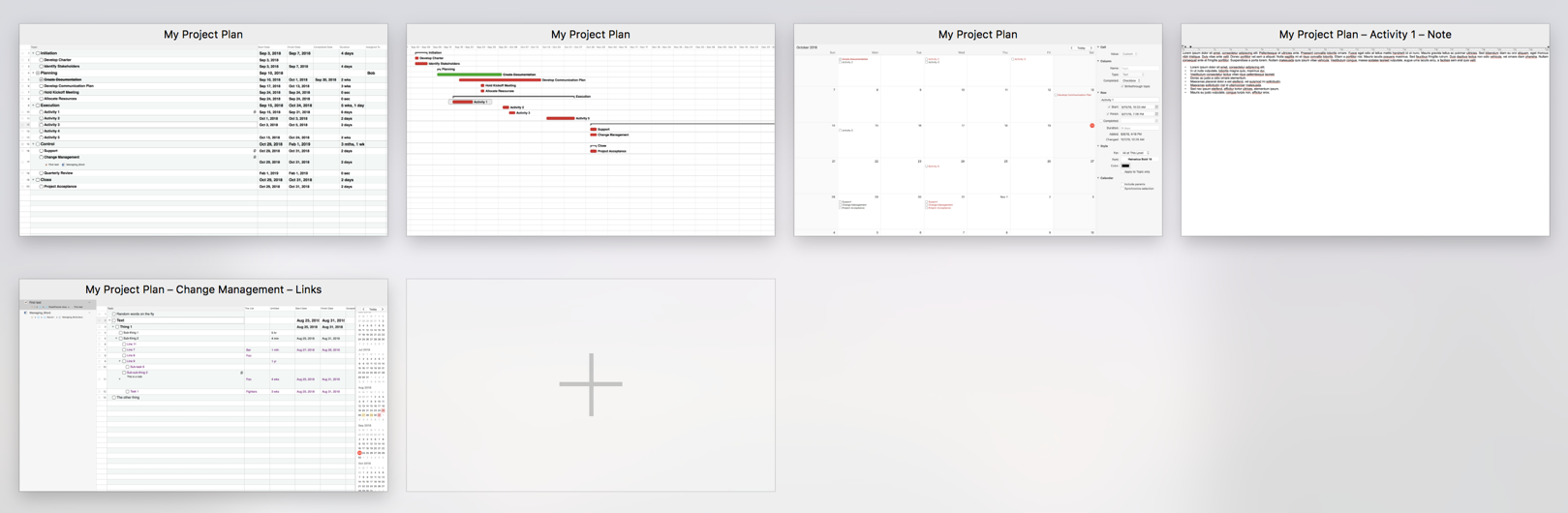
The Template Chooser
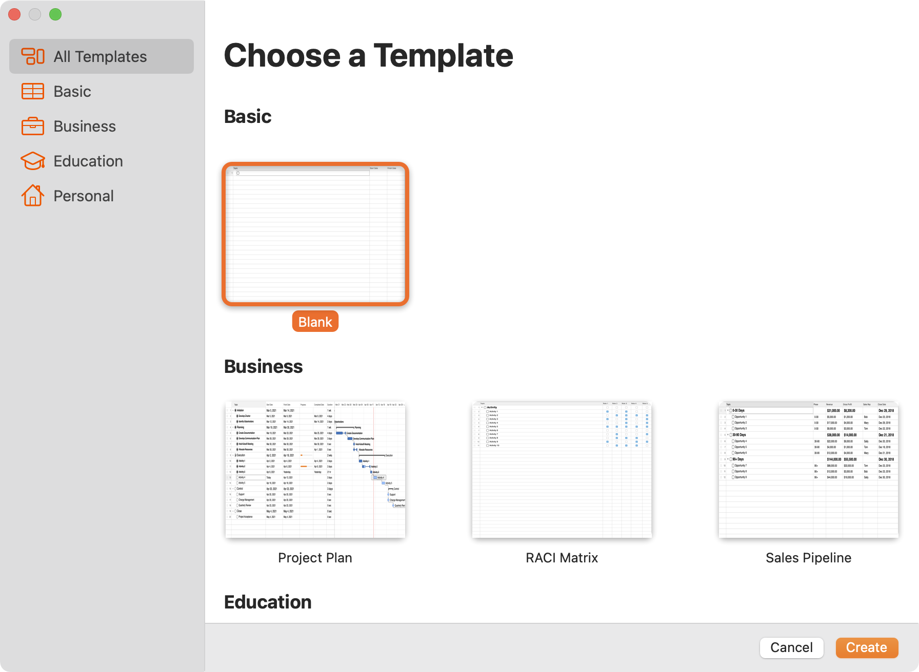
When you start SheetPlanner without an active document or create a new document, the Template Chooser opens. Scroll through the list of pre-defined templates, or choose a filter on the sidebar to view templates of a particular type. Click the thumbnail of the template you want, and then click Choose.
You can update your SheetPlanner preferences so that when you create a new document it will either open the Template Chooser, use a default template you specify, or create a blank document. See Preferences for more details.
Custom Templates
Save any SheetPlanner document as a custom template. Within the document, go to File > Save as Template.... Custom templates are listed under My Templates in the Template Chooser sidebar. From the Template Chooser, right-click on a custom template to rename or delete it.
Saving and Syncing
By default documents are saved on iCloud Drive, and are synced to other devices logged in to your iCloud account. You can also save to a local folder if you prefer.
The SheetPlanner Window
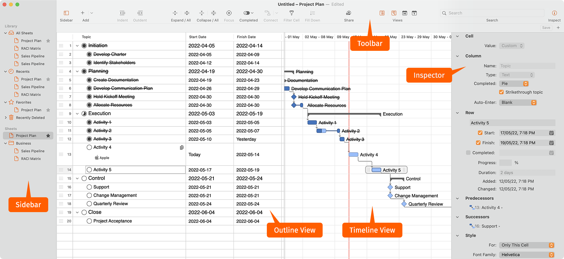
The SheetPlanner window has a number of views available for you to choose from.
You can change which panels to view from The Toolbar.
The Sidebar
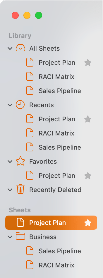
A SheetPlanner document can have multiple Folders and Sheets. The Sidebar allows you to view and organize them.
Built-in Folders include:
- All Sheets
- Recent Sheets
- Favorite Sheets
- Deleted Sheets
Go to the Sheet menu to create, rename, or delete Folders and Sheets.
The bottom of the Sidebar lists all Sheets in the document, which can be arranged into Folders.
Click the Star next to a Sheet to add it to Favorites.
Right-click a Sheet to perform other functions.
The Toolbar

The SheetPlanner toolbar allows you to quickly access many of the main functions.
- Add: Click + to add a new row. Click the arrow to choose to add either a new row or a new column before or after the currently selected one. You can also add a new folder or sheet via this menu.
- Indent: Indents the currently selected row. This makes the current row subordinate to the one above it.
- Outdent: Outdents the currently selected row. This promotes the current row in the hierarchy.
- Focus: Hide all but the currently selected row and any sub-tasks. When you are in Focus mode, the currently selected focus item is shown in a bar in the Topic header.
- Completed: Click to display a menu for how to display completed tasks:
- Show Completed: Show both completed and incomplete tasks.
- Show Completed Today: Show tasks completed today, and incomplete tasks. Those completed on previous days are hidden.
- Hide Completed: Show only incomplete tasks. All completed tasks are hidden.
- Connect*: Add connections to denote dependencies between items. When two or more rows are selected, they can be connected so that a change in the Start, Finish, or Completion date in one adjusts a date of the other. Select two or more rows and click the down-arrow to choose the dependency type:
- Finish to Start: Links the Finish date of the first selected item to the Start date of the next. The first item must end before the second one starts; the items can not overlap. This is the most common type of dependency, and the default selection if you click Connect.
- Start to Finish: When the first item starts, the second one can end and the items will overlap.
- Start to Start: When the first item starts, the second one can start and the items may overlap.
- Finish to Finish: When the first item ends, the second one can end and the items may overlap.
- Share: Click to display a menu with sharing options:
- Share File: Start to share the document with other people, enabling collaboration.
- Show/Hide Highlights: When highlights are hidden, changes on other devices are briefly highlighted; when highlights are shown, the change highlights remain visible.
- Send a Copy: A sub-menu of ways to send a copy of the document to others. These don't sync changes.
- Views*: Show or hide the Outline, Timeline, Month, and Year views. You can have any combination of views showing at any time. Hold the Option key when clicking a button to show only that view.
- Search: Enter text you want to search for. Any cells that contain the entered text are displayed in the Outline and Timeline views.
- Inspect: Open the The Inspector panel.
Additional buttons that you can add by customizing the toolbar include:
- Expand/All: The left button expands the currently selected row. The right button expands all nested rows in the document.
- Collapse/All: The left button collapses the currently selected row. The right button collapses all nested rows in the document.
- Filter Cell*: Create a new smart filter based on the currently selected cell. See Filters for more details.
- Fill Down: With multiple cells selected, fills the contents from the top cell into the others.
- Orientation*: Show the currently selected Views in either a Horizontal or Vertical orientation.
The Inspector
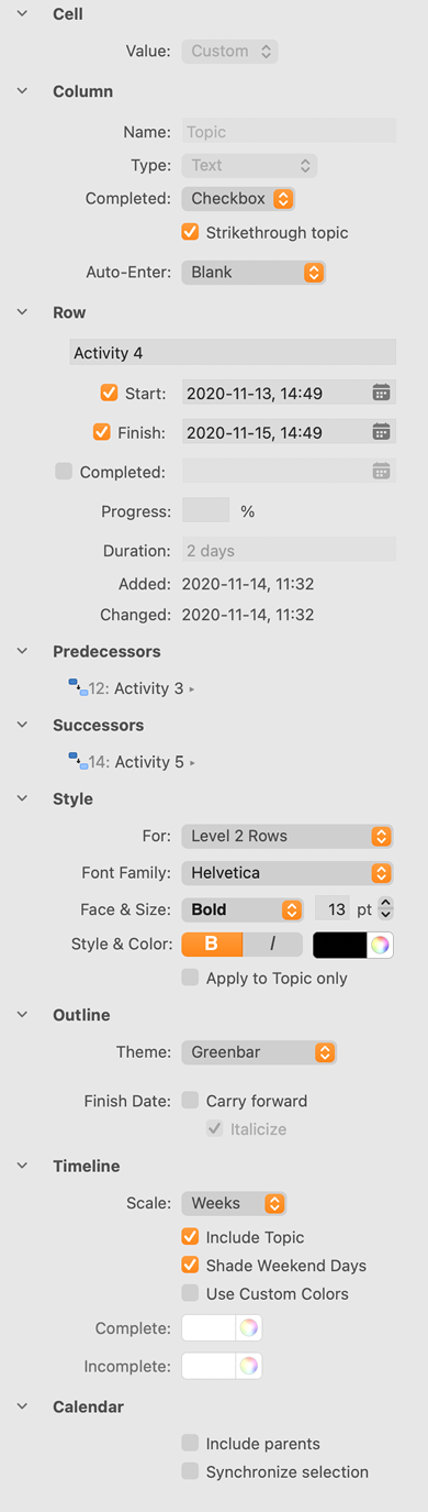
The Inspector panel allows you to customize the appearance of the document and changes depending on the context of the selected cell or panel. This list provides a general overview of the available options.
Cell
- Value: All column types have calculations of some sort. For example, with Date columns, if a parent date field is selected, you can automatically calculate the planned Start and Finish Date based on dates in the child rows, or calculate the value for all rows of the Duration column.
- Notify: If you selected a date cell, select to add a notification when this item is due, then specify how long before the deadline you want to be notified.
- Changed: If a cell has been edited, the date, author, and device where the change occurred will be displayed.
Column
- Name: The name of the selected column and can only be changed for custom columns.
- Type: Change what kind of content the cells display.
- Text: Select to show text content.
- Number: Select to show numerical entries and choose how they should be formatted.
- Progress: Select to show a progress indicator for the item and choose how the progress is displayed.
- Date: Select to show a date and time format.
- Time Interval: Select to show a time interval.
- Symbol: Select to show symbols and choose the kind of symbol and how they are displayed.
- Picture: Select to show a picture and choose how they are displayed.
- List: Select to show a pre-defined list of options to select from.
- People: A special kind of List, used for the built-in People column, that includes collaborators on a document, plus custom people. Colors can be assigned to each person.
- Button: Used for Successor and Predecessor column types and is not applicable to a custom column.
- Auto-Enter: Select whether content in this column is automatically generated and the formatting.
Row
- Name: The current row topic name.
- Start: Select to assign the planned start date, and then select the date from the calendar pop-up.
- Finish: Select to assign the planned finish date, and then select the date from the calendar pop-up.
- Completed: Select to assign the completion date; the date automatically fills in when the topic is marked as completed.
- Progress: Enter the percent of progress completed.
- Duration: Automatically calculates the time between the planned Start and Finish dates.
Predecessors and Successors
- If this item has dependencies, they are listed here. Click the Predecessor or Successor to go to that item.
Style
- For: Select the scope of the style; whether the change will affect all other rows of this rank or if this row should have a custom style. Each indentation level can have its own shared style.
- Font Family: Select the font.
- Face & Size: Select the text style and size.
- Style & Color: Select the text style and color.
- Apply to Topic only: Select to apply this style to the Topic column only. If unselected, this style applies to all columns.
Outline
- Theme: Select a color theme for the Outline view.
- Finish Date:
- Carry forward: Select to set all past-due items to today.
- Italicize: Select to display all carried-over items in italics.
Timeline
- Scale: Choose the scale of each column: days, weeks, months, quarters, or years.
- Include Topic: Select to display the topic after each timeline bar.
- Use Custom Colors: Select to use a color of your choice to denote Complete and Incomplete items.
Calendar
- Include parents: Select to include all parent rows in the Calendar view.
- Synchronize selection: Select to change the behavior of the Calendar view. If checked, selecting a cell in any view will change the selection in the calendar views; otherwise the calendar has independent selection.
Outline View
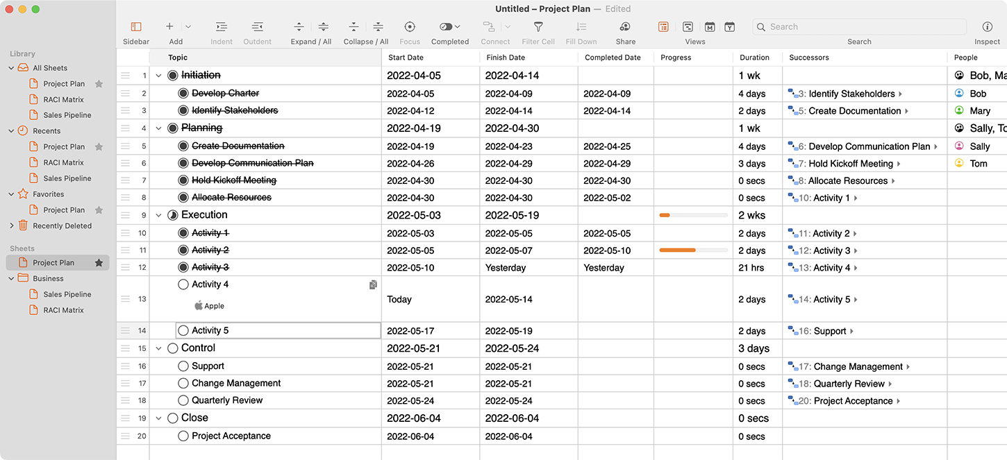
The Outline View is the main view for working in SheetPlanner and should look and feel familiar if you’ve used an outliner or spreadsheet, but includes powerful formatting functions to make your planning easy, down to the last detail.
Click or arrow around to select cells. Click on a selected cell, or press Enter, to edit the cell value. Some cell types include a button to pick a value, e.g. for a Date cell you can type a date or click the button to show a date picker.
From the Outline View you can:
- Add or remove rows and columns.
- Use The Inspector to change properties.
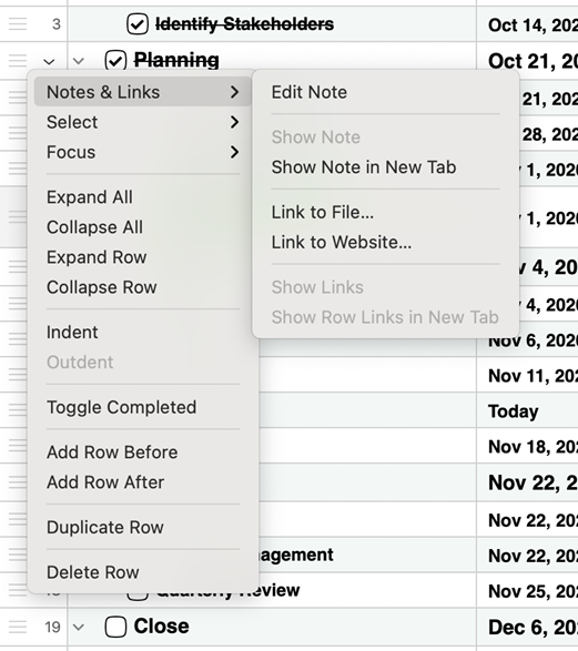
- Right-click a row to access the Row Menu for more organization options.
Timeline View*
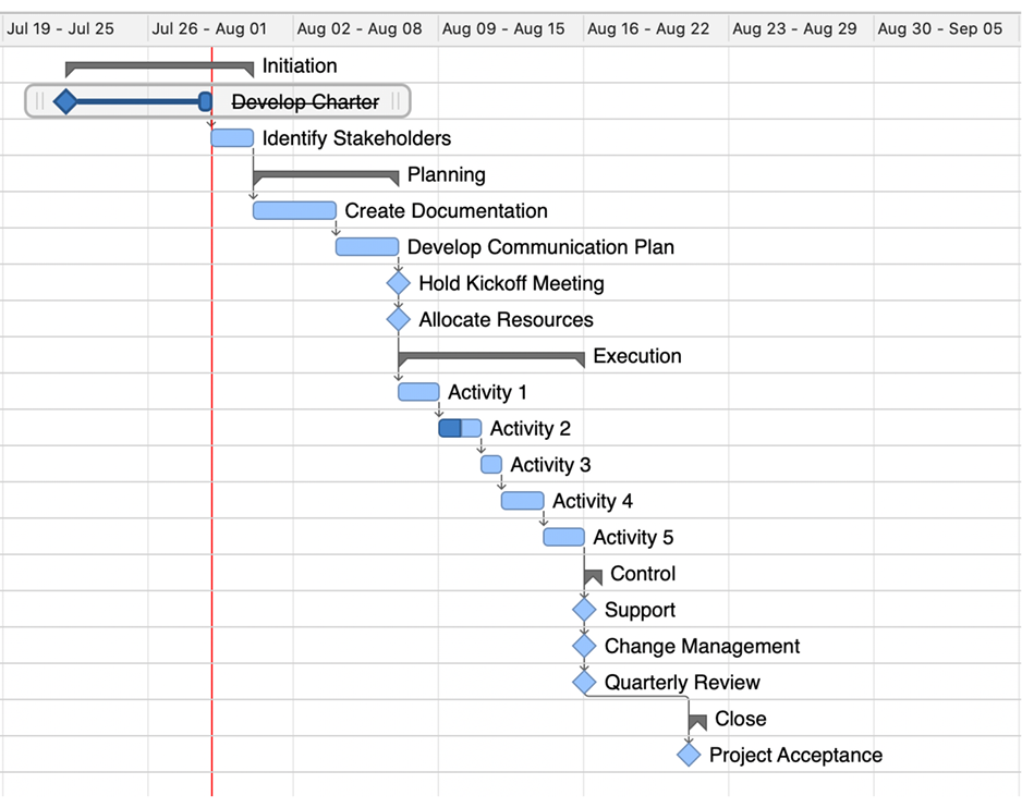
The Timeline View shows a detailed chart to see your tasks scheduled over time, allowing you to view the start and end dates in one simple view.
Click and drag a start or end date for any task; the dates automatically adjust in the Outline View. You cannot adjust the start and end dates for a parent row that has dates calculated from its child rows.
- Hold Shift or Command to select multiple rows and drag them all at once.
- Add connections to denote dependencies between items. Select two or more rows and either right-click and choose Connect or click Connect in the Toolbar.
Month View*
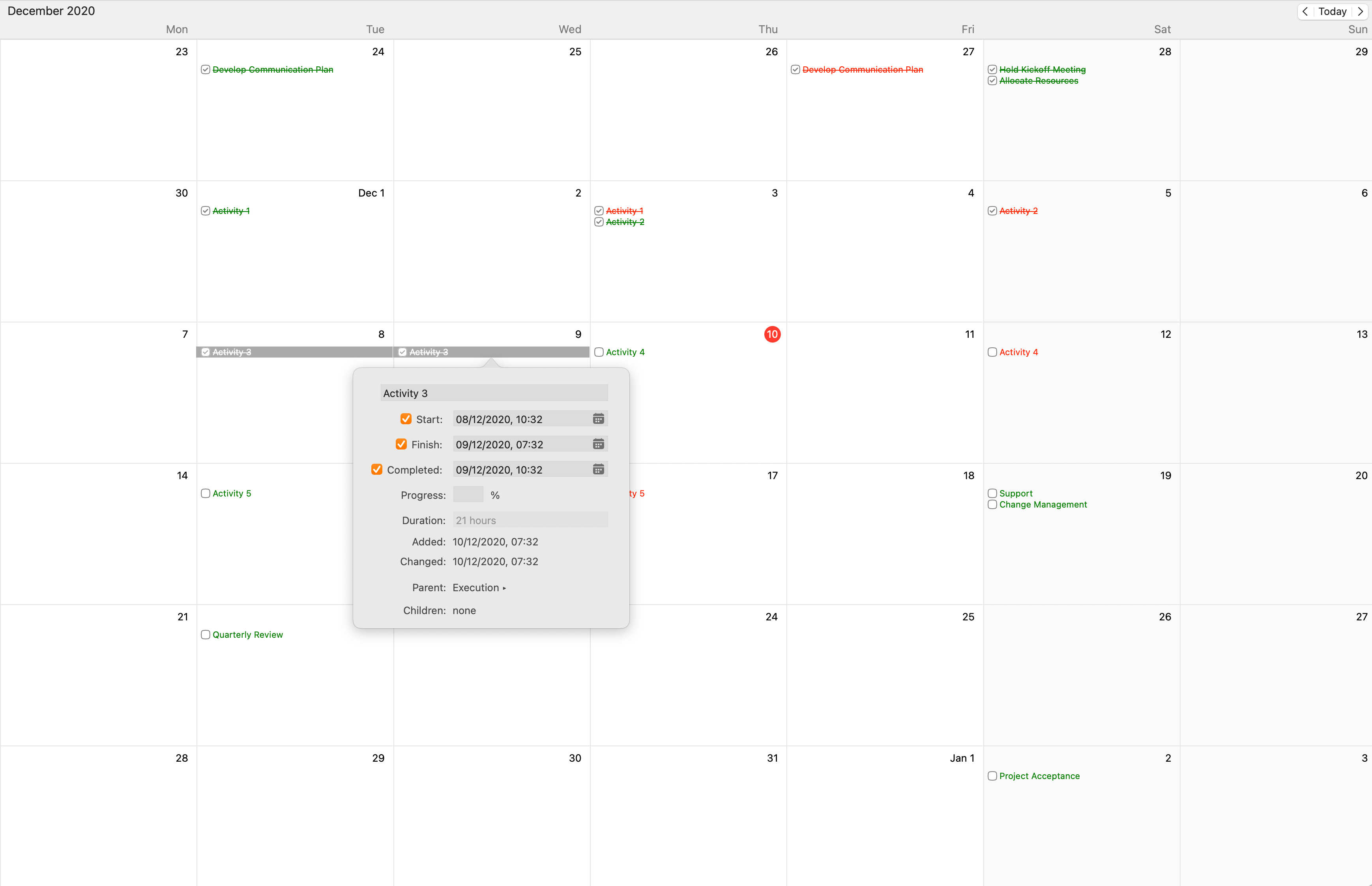
The Month View shows your project plan on a monthly calendar, allowing you to see at-a-glance what tasks are due during the month.
In Month View you can:
- Hover over an item to view a summary.
- Click once on an item to highlight its start and end points.
- Double-click on an item to open a window where you can view and adjust details about the task including its name, start, finish, and completed dates.
- Click on the box next to a task to mark it complete.
Year View*
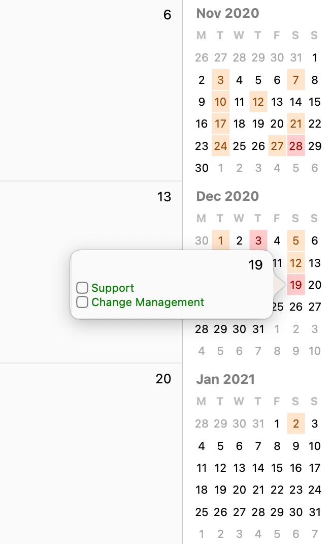
The Year View shows your tasks on a yearly calendar, allowing you to see at-a-glance what tasks are due during the year.
Click on a highlighted day to see the tasks associated with that day and mark tasks as completed.
Filters*
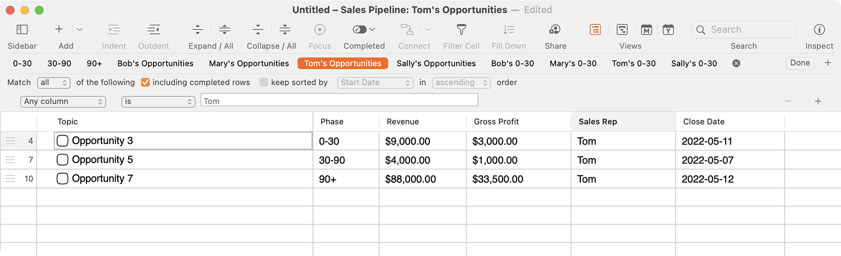
There are three ways to create Filters in SheetPlanner:
- Use the Search field in the toolbar, and then click Save to convert the search text into a filter.
- Filter by Cell Value: With a cell selected, either click Filter Cell in The Toolbar or go to Filter > Filter by Cell Value.
- Create a Smart Filter: Go to Filter > New Smart Filter to open the Filter Bar.
- Select the filter criteria you want from the available options.
- Click + to add another line to your criteria.
- Click – to remove a line.
- Click Save when you’re done and give the filter a name. All your saved filters are shown in the Filter Bar above the SheetPlanner document.
- Click a previously saved filter name to filter the active document, or click the X next to the filter name to no longer filter the document.
- Right-click a filter name to see more options.
Notes and Links
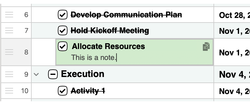
You can add Notes and Links to any row in SheetPlanner.
Notes
- Use Notes to include more information about the cell.
- While editing a Topic, click the Note icon to enter a note in the cell.
- Right-click the row and select Show Note in New Tab to open a tab that displays the note, making it easy to edit long entries.
Links
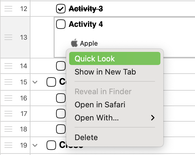
- Right-click a row and select Link to File... and then select the file.
- Right-click a row and select Link to Website... and then enter the URL.
- Right-click the row and select Show Row Links in New Tab to open a tab that includes previews of all the sites and files you’ve linked to in the row.
Windows and Tabs*
Tabs enable you to see multiple views of the same document. Use Tabs to:
- Open Links and Notes in separate tabs to view their information.
- Drag a tab to a second screen to see multiple views at once.
- Right-click a previously-saved Filter or Focus name to open the results in a new tab.
Navigating Between Tabs
- Press Ctrl + Tab and Ctrl + Shift + Tab to move forward and backward through your open tabs.
- See thumbnails of all your tabs with View > Show All Tabs. Click a thumbnail to make it the active tab or click + to add a new tab.
Print Preview
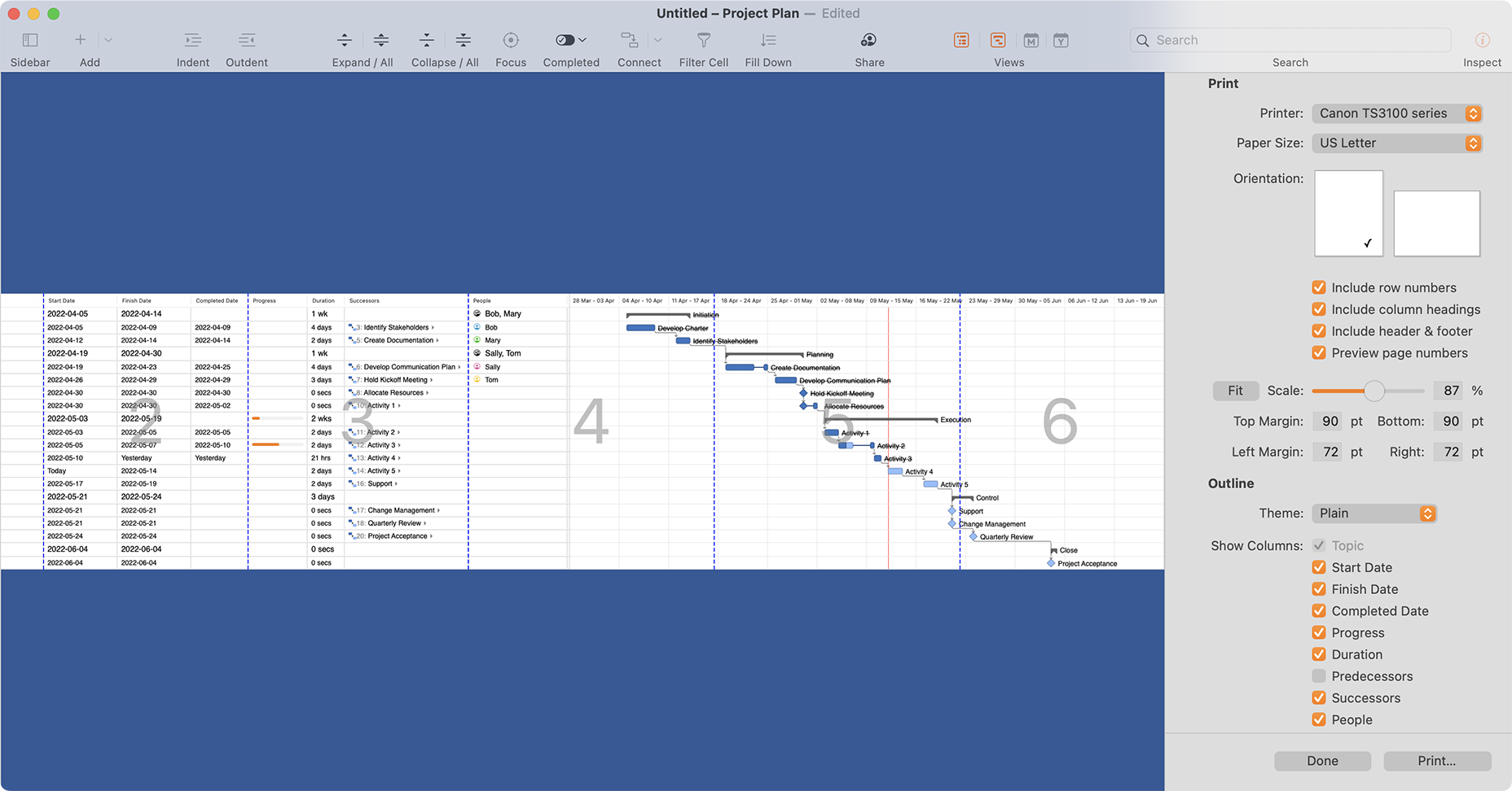
When you choose to print your document, the window displays a preview of the page layout and the Inspector shows various printing options.
In the preview, click row and column headers to choose what will be printed.
Preferences
Configure your preferences to personalize how you work in SheetPlanner.
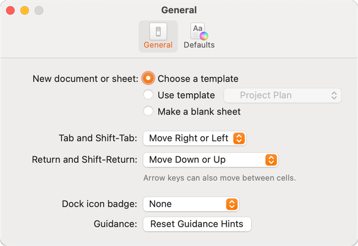
General
- New document or sheet: Choose what should happen when you open a new document:
- Choose a template: Open The Template Chooser in order to select any pre-defined template.
- Use template: Specify a template to use every time.
- Make a blank document/sheet: Open a blank document or sheet.
- Tab and Shift-Tab: Choose the behavior of the Tab key:
- Indent or Outdent: Tab indents/outdents the current row.
- Move Right or Left: Tab moves the cursor to the next column.
- Return and Shift-Return: Choose the behavior of the Return key:
- Insert Row After or Before: Return inserts a new row.
- Move Down or Up: Return moves the cursor to the next row. If you’re at the last row, Return adds a new row after the current one.
- Dock icon badge: Choose what the SheetPlanner icon in the dock should display.
- Guidance: Reset the guidance hints so they show again.
Defaults
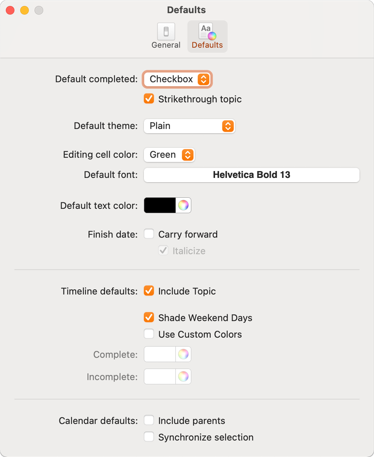
- Default completed: Choose how the Completion checkbox appears next to each topic and select whether to Strikethrough completed topics.
- Default theme: Choose which theme to apply to new documents.
- Editing cell color: Choose the color for the cell you’re editing.
- Default font: Choose the default font.
- Default text color: Choose the default text color.
- Finish date: Choose whether past-due items should carry forward to the current date and if they should be italicized.
- Timeline defaults: Choose the default appearance for the Timeline.
- Calendar defaults: Choose the default behavior for the Calendar.